Windowing
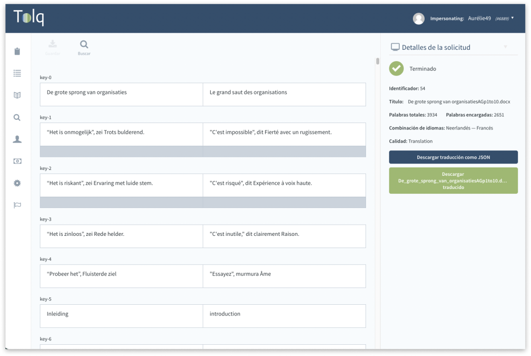
This caption at the right shows what we call the Content UI, a view where the client can browse one of their translation requests.
A translation request can have almost any size from just a few words to the length of the entire works of Miguel de Cervantes.
Like with books the most important feature of this UI for the user is to be able to read a group of segments without breaking the flow.
Standard pagination will frequently put a paragraph's segments in different pages, obviously breaking the reading flow.
In this page you'll find some of the highlights of the rabbit hole that was designing and implementing this feature, which took me from reasearching how ebooks handle the same challenge to hacking existing windowing solutions.
To infinity and beyond
Why not simply use an infinite scroll?
Infinite scrolling is a nice pattern to lazily load a gallery of images. That is because in that case the goal of the user is to browse all of them without really caring about going to a specific image.
But that doesn't work for a user who wants to correct the content from the middle of a 20 pages word document.
This user will expect to be able to grab the scroll bar, drag it to roughly the middle point and from there find their way out to their target scrolling up or down. In other words, they need windowing.

Why not using same sized segments ?
After defining that we need windowing, a first exploration of the technique tells us that if all the segments had the same height implementing the solution becomes pretty trivial.
It is just a matter of multiplying the number of segments by the height and we got our scroll height. Scrolling to a particular segment is just a matter of multiplying its index position times the height and voila we are there.
But it is not that easy. Segments length can vary greatly in the same translation. Make them too big and the reading experience becomes janky and more difficult, make them too small and you have to scroll within every single one of them, completely breaking the reading flow.
Obviously this resulted in me keeping on thinking how to go from traditional windowing to something more complex.

The challenges with growing segments
Once I thought I had nailed it out I realised that with certain languages, Spanish among them, the same thing could be expressed in different ways that would give them a significantly different length.
I also realised that at some point I would like to apply this technique in the Translation UI where the dramatic length change would be even more frequent, since the user starts with empty textareas.
Since we sync segments with exactly the same copy, this sudden length change could happen in several places at the same time.
This took me to the drawing table again to figure out how to deprecate old segments heights and keep them always looking nice.
