Data Tables
From a blog site to Google search, almost every single web app in the planet needs to list their content.
Sometimes the content needs to be pretty, sometimes highly interactive and some other times simply functional.
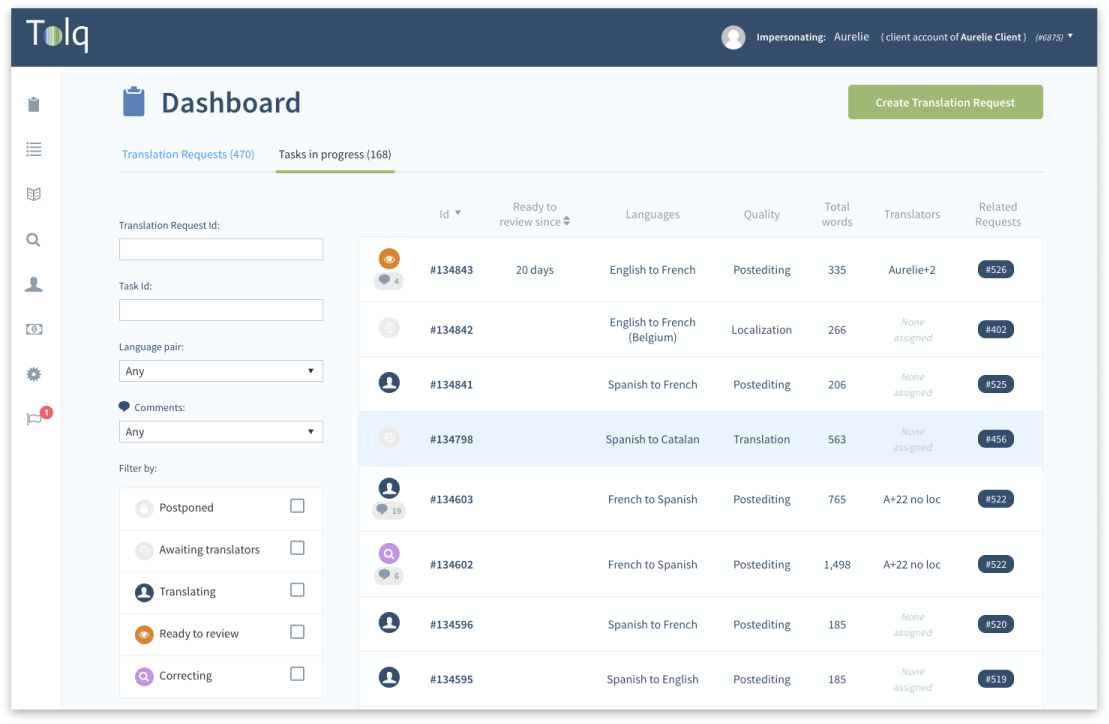
Tolq is no exception, and during my time there I have designed (and redesigned) several data tables.
As soon as we add filters to the equation several interaction issues arise that we need to design for carefully.
Below I will show some of those using as example a generic Data Table component I designed and implemented recently.
Designing a great generic Data Table
Keeping the url synced
When the user changes the filters of the listing the url is updated, allowing them to share the current status of their page.
On top of that the browser history is properly modified, allowing the user to get back to the last state of their page.
If they keep going back it does not force them to go through every single filter change and takes them to the page they visited before the Datable.

Debounced filters
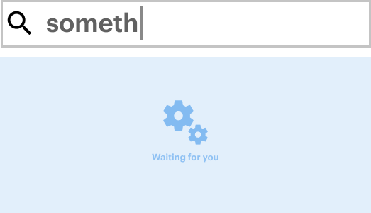
When free text inputs are used the query is not automatically sent, instead the component waits for a few milliseconds to wait the user finish typing.

Overflow managament
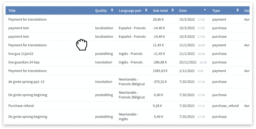
Scrolling tables horizontally is pretty unergonomic in most computers. It requires to scroll all the way down to the bottom of the table and then drag a not always easy to grab horizontal scrollbar to finally scroll back up to check the result.
My component detects when the table has enough space to be displayed normally and does so.
But if the table is too big the style changes showing the "grab" cursor when hovering it and the "grabbing" cursor at clicking. Some mouse event listeners are added allowing the user to scroll horizontally.

Configurable content
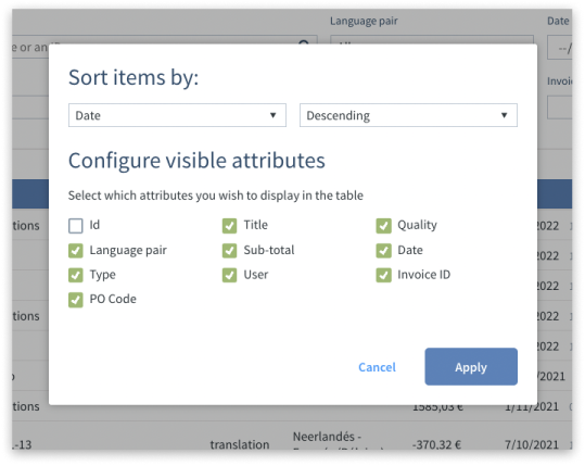
Even with the included scrolling affordances, seeing all the content one is interested into in a single look is far superior.
Generally too many items create noise that makes parsing information far more difficult.
Because of that the Data Table component allows you to select which items you want to see.
